Choosing the right colors for your custom neon signs can significantly enhance the aesthetics of your space. Heres how to make sure your neon sign not only stands out but also complements its surroundings perfectly.
Don't Match Everything
Avoid matching your neon sign color too closely with the background. For instance, a red neon sign on a red wall or a yellow sign on a yellow background can look monotonous and uninspired. Instead, use contrasting colors to make your sign pop and add visual interest to the space.
Choose the Right Color for the Setting
Consider the context where the neon sign will be displayed. Different settings call for different color schemes. For example, vibrant colors might suit a work desk or a lively caf, while softer tones could be more appropriate for a bedroom or a romantic setting. Choosing the right color ensures that the neon sign enhances the intended mood and ambiance.
Combining Cool and Warm Colors
Be cautious when mixing cool and warm colors. While contrasting and complementary colors can create striking visuals, cool and warm colors often clash. This can result in an unpleasant visual experience. Stick to either a cool or warm color palette to maintain harmony.
Avoid Equal Proportions of Colors
Avoid using equal parts of each color in your design. This can create a chaotic and unappealing look. Instead, opt for a dominant color that the neon sign will accentuate. This approach creates a focal point and enhances the overall visual impact.
Color Combinations You Can Try
Certain color combinations work exceptionally well and can transform your interiors if used correctly.
Complementary Colors
Complementary colors are those that sit opposite each other on the color wheel. Using lighter tones in neon signs against darker backgrounds can create an energizing environment. For instance, a light blue neon sign against an orange background highlights both colors effectively.
Contrast Colors
Contrast colors are those with stark differences in hue, like black and white. While complementary colors accentuate each other, contrast colors emphasize their differences. A dark green background with a light pink neon sign creates a striking and beautiful visual.
Analogous Color Schemes
Analogous color schemes use three colors next to each other on the color wheel, creating harmony without being dull. For example, red, orange, and yellow can work beautifully together. Any of these colors in a custom neon sign will blend well with an analogous background.
Effective Color Combinations
Here are some effective neon color combinations to use with various backgrounds:
- Red Background: Yellow, white, green, or blue neon lights. Beige and multicolored lights can also work, depending on the interiors color scheme.
- Brown Background: Cream, pink, and light-green neon lights work best. Bold colors like red and purple can be used selectively.
- Orange Background: Blue, violet, or white neon lights are ideal. Avoid pink or red to prevent a dull setting.
- Yellow Background: Blue, violet, and sometimes red neon lights work best. Avoid cream, pink, or yellow lights.
- Green Background: Orange, golden, reddish shades, blue, or pink neon lights work well. Golden yellow is particularly effective.
- Blue Background: For dark blue, use lilac, yellowish-green, yellow, orange, red, or white neon lights. For light or sky blue, choose cherry red, pink, cream, or dark purple. Avoid light green.
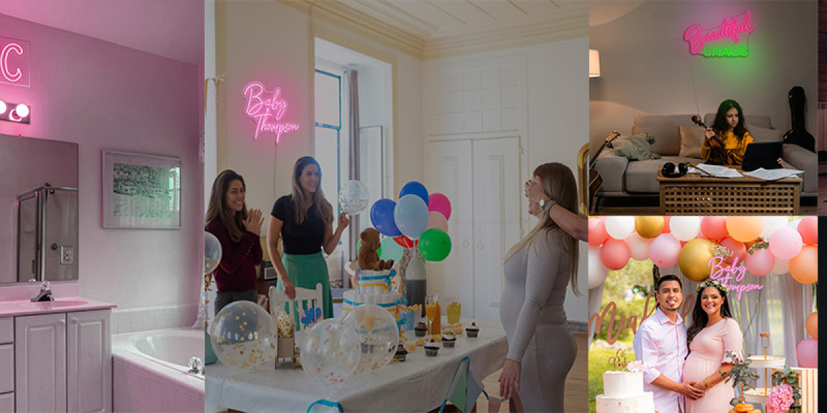
- Pink Background: White, green, blue, or turquoise neon lights work best. Green and orange can also be used in some cases.
Combining Colors
While these guidelines offer a solid starting point, dont be afraid to experiment and trust your creativity. Colors have millions of shades, and the best combinations often come from unique and personal choices.
For a wide variety of custom logo neon signs in numerous colors and designs, consider options from CreateNeon. Trust your instincts and pick the best one for your space to make it truly shine!